
Applications like seasonings, sauces, dressings, and other condiments, are key to creating culinary experiences both at home and in restaurants. Adding natural colours to these applications can enhance their look and support the new flavor and food experiences customers crave. However, there are some important factors to consider when selecting the best natural colour for these savory seasonings and sauces. To help make your decision easier, we’ve broken down the top 5 considerations for colouring culinary sauces, seasonings, and condiments.
1. Physical Base Characteristics
One of the first things to consider when colouring savoury applications is how the base colour of a sauce or seasoning will impact the final look of the coluor in your application. For example, a beta-carotene powder added to a pure white base is going to look more vibrant than when it’s added to a base that contains other underlying hues or ingredients, like a seasoning blend with various herbs and spices. You can see in the photo below that the herbs and spices in the seasoning blend already have an inherent colour so the beta-carotene colour is not as obvious in the spice blend and looks a lot darker than the salt or maltodextrin.

In addition to the base colour, the particle size of the base components will also be a determining factor in colour selection. Some products may have fine particles, some large particles, and others a mixture of both. Using the same weight to weight dose of colour for different densities will give different volumetric dilutions that are perceived as having more or less colour. Particle size can also have an impact on colour consistency in the final result. A smaller particle size could give the appearance of some colour variation or striation while a larger particle size could give an appearance of a more even colour application.
2. Base Chemistry
Another important factor when colouring culinary is the chemical characteristics of the base. Specifically, the pH and the solubility since the successful use of natural colours highly depend on these two factors. The pH can significantly affect natural colours, especially when using an anthocyanin, where lower more acidic pHs result in red/pink hues while higher pHs, particularly above 4.2, can result in purple/gray tones.

3. Thermal Processing
Knowing whether or not your product will undergo any sort of heat treatment is also important when working with natural colours since some colours will stand up to heat processing better than others. For example, adding spirulina to a sauce or dressing that will be retort processed will typically result in significant colour fading, as seen in the image below. Using a more heat stable pigment in this scenario, such as a carmine or paprika, would allow for the pigments to stay vibrant during the heat treatment process. Alternatively, increasing the initial colour dosage rate could help offset the amount of colour loss or browning experienced during heat treatments.

4. Light Exposure
The amount of light a product will be exposed to during its shelf life is another key factor in choosing the best colour for your culinary creation. This is often determined by the type of packaging used. Will the product be in a clear bottle or container, or will it be in some sort of opaque packaging like a can? For example, a product with turmeric might see some significant fading if exposed to light, since turmeric is not considered a light stable colour. However, certain forms of turmeric can be more stable to light than others. Micronized dispersions of turmeric have tightly packed curcumin molecules which allows for colour vibrancy while protecting the pigment more from light exposure. In controlled experiments, we have observed extended colour retention in a simulated supermarket lighting setting when compared to other forms of turmeric.
You could choose a natural colour that is more light stable, like beta-carotene or paprika. The addition of antioxidants, whether in the colour itself or in the product, can also help reduce colour fading over time. Certain colours, such as copper chlorophyll, red beet, and carotenoids typically benefit from the addition of around 250 ppm of ascorbic acid, seen in the image of paprika in breading below. Like with heat processing, increasing the initial colour dosage rate could help offset the projected color fade.

5. Flavor
And last, but certainly not least, making sure the colour of the product aligns with the flavor identity is crucial when bringing new products to the market. For example, it probably wouldn’t make sense to colour a hickory smoked, molasses barbecue sauce with a bright orange paprika colour. That wouldn’t match people’s expectations of that flavour description. Utilizing a rich caramel colour to deepen and enhance the natural brown colour of the base sauce would be a much better fit.
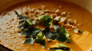
People often associate colour intensity with flavour intensity. A sauce or condiment with more colour might be perceived as having more flavour than a lighter, pastel-coloured sauce. In the photo below, the darker orange sauce made with our emSeal® Paprika colour could be perceived as having the intense flavour of a curry ketchup. The lighter orange sauce might be seen as having a lighter, less intense flavour like roasted red pepper mayo.

Figuring out which natural colour works best when colouring culinary applications can be tricky, but our experts are here to help you through the process. Need some help deciding? Contact us with your questions or request a natural colour sample to get started!
Related posts

Podcast: Visual Flavour
Visual FlavourHow Colours Enhance Snack Experiences Speakers: Catalina Ospina, technical marketing specialist; Lora Sparks, digital marketing specialist; Scott Ondracek, senior regulatory specialist (and snack guru). In this podcast episode, we try several

Podcast: Sizzling Shades
Sizzling ShadesThe Role of Colors in Fire Cooking Speakers: Sara Diaz, Global Marketing Manager for Savory Taste for Givaudan, Katie Rountree, Regional Product Manager - Americas for Sense Colour, and Catalina Ospina, Technical Marketing Specialist for Sense
Browns in Savoury Applications
Savoury foods seem to be intrinsically linked with the colour brown. Think of any savoury dish, and chances are that it has warm tans, golden hues or deep brown shades. And there is reason for that! In this article we’ll explore this association and the