
Why do you ask so many questions?
When you request a natural color sample for your project, we generally start the conversation by asking you some questions. And while some of these may seem a little intrusive, the answers provide important information that help us select/create the best color solution for your product.
Because natural colors can require more technical know-how than synthetics, we need more information so we can get you a color that will not only look great, but also perform well in your application. Details about packaging, other ingredients in the formula, and certifications will all impact color selection.
Below we share some of the most common questions we ask when starting a project and why we ask them.
What limitations does your project have?
The first questions we always ask revolve around limitations: ‘Are there any limitations for your project in terms of cost-in-use, dosage rates, or any “no-no” ingredient lists?’ Not only does this information help narrow down the wide range of colors to choose from, it also provides guidelines so we stay within your project parameters from the get-go and can better meet your expectations.
For example, if you only have room in your product formulation for 0.01% color, we may start with a higher strength color. Or if you need a stable brown but have to comply with a retailer’s ‘simple label’ list, we would suggest one of our Naturbrown® options.
Does your product need to meet any certifications?
Another important consideration are the certifications your product requires. If you product is certified Kosher, Halal, Non-GMO Project Verified, or Organic, for example, the colors you use will also need to have these certifications.
By providing this information at the start of a project, we can narrow down the available colors and only work with ones that fit your requirements.
What can you tell us about your base?
Base formulas are complex, so we spend a lot of time on these questions to make sure we provide a color that makes your product look great and will remain stable throughout its shelf life. Things that we touch on are:
What is the color of your base?
Are you working with a clear or cloudy beverage? Does your meat alternative use soy protein or pea protein? The appearance of a natural color can vary significantly from one base to the next, so understanding what the starting point looks like helps determine the best colors to try.
Oat-based beverages, for example, are an off-white cream color while rice-based beverages are brighter white. Additional color or even a different color may be required to overcome the base tones of the oat beverage compared to the lighter rice beverage. The below image shows what three colors at the same usage rates look like in beverages with different base colors.
Going one step further and providing your base for our scientists to work with, can result in an even better color match to your target.

What other ingredients are in your formula?
Ingredients, especially when it comes to beverages, are important to understand when choosing a natural color solution.
Emulsifiers are a prime example of this. Many beverages contain emulsifiers in their flavor systems. Some natural colors, especially carotenoids like beta-carotene or paprika, also utilize emulsifiers. If the two types of emulsifiers interact, it could result in a broken emulsion and ringing around the top of the beverage as seen in the one below.

What is the pH of your application?
Many natural colors are also sensitive to pH. Anthocyanins like our Amaize® Red, for example, change colors as the pH changes. In a pH 3 sorbet it will appear a nice pink-red shade. But as the pH increases, as in frozen yogurt or ice cream, it will appear more purple.
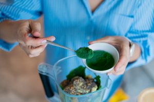
Other colors, like spirulina or beet, will even precipitate out at a pH below 4. So by providing the pH of your application, we can stay away from colors that won’t stand up to your formulation.
What form of color do you need?
Does your system require a water or oil soluble color? Do you prefer to work with a powder or liquid? Product formulations and manufacturing processes vary greatly, so providing information on the form of color that is easiest to incorporate into your manufacturing process or the type that works best in your formulation helps guide color selection.
What is your manufacturing process like?
Understanding what processing your product will need to endure is critical to suggesting the right color. HTST, baking, and extrusion require colors with high heat stability, for example.
Order of ingredient addition can also play a big role in natural color stability. If you add a color at the beginning of a sugar boil when making confections, you’ll need a more heat stable color than if you add it at the end of the boil. And if you’re able to change the order of ingredient addition, that information helps, too!
How will your product be stored?
Lastly, we ask questions about how your product will be stored. Is your beverage stored ambient or refrigerated? Will container be transparent or opaque?
Turmeric, for example, provides excellent yellow colors for lemon ice cream. But if your ice cream container has a clear window, we’d select our Emulsitech® beta-carotene instead.
Sharing information on how the product will be packaged and stored, as well as your shelf life will result in better color stability over the life of your product.
This is a lot – we know! But at the end of the day, we just want to help you find the best color for your product and the more information we have, the better we can meet your expectations and help you create a beautiful product for your customer.
Ready to get started? Contact us about your next color project.
Related posts
Podcast: History of Colours
Past and Present of Food ColoursYou have to know the past to understand the present Speakers: Catalina Ospina, technical marketing specialist and Katie Floyd, marketing specialist. With all of the news about food colour, we dive into the history of both

Healthy Indulgence: Colourful Goodies for Gen Alpha
The colour of healthy indulgence: BFY snacks Gen alpha ate! Figuratively and literally! Their ever-growing influence on household purchasing decisions is driving the development of adventurous sweet treats and confections. Digital experiences, visual appeal,

Podcast: Visual Flavour
Visual FlavourHow Colours Enhance Snack Experiences Speakers: Catalina Ospina, technical marketing specialist; Lora Sparks, digital marketing specialist; Scott Ondracek, senior regulatory specialist (and snack guru). In this podcast episode, we try several

Colouring Healthy Snacks
The colour of healthy indulgence: BFY snacks What is snacking for you? Is it any food that is consumed between the main meals? Or something to deter hunger + boost stamina when energy is dwindling mid-afternoon? Or maybe even a treat to relax and celebrate

Snack Trends of 2025
Colorful snacking trends to watch and enjoy Snacking is a universal habit, and yet, we all snack differently according to our demography, age, and cultural context. Terms like “empty calories” or “ultra processed foods” didn’t exist in the

Understanding ADI
Natural colours are considered food additives in the food and beverage world and are strictly regulated in terms of their identity, purity, the food categories in which they are allowed, and their usage rate. A recent example is the 2020 EFSA review of