
Consumers are increasingly interested in ‘authentic’ food and beverage experiences—they want food that is as close as possible to its original ingredients or source. This can include minimally processed foods, foods that taste, smell, and look traditional, or even foods resembling what can be found in nature.
But how does nature really look? What is the colour of authenticity? In this article we explore how natural colours can be used to create earthy to bold to pastel shades to achieve colours that can represent those authentic dishes.
Earthy and wholesome
On one hand, ‘authentic’ could refer to simplicity in nature. Think whole-grain foods like cereal, nuts, and seeds, unrefined flours, brown sugar, cooked meat and poultry, etc. This beige to brown palette is made up of muted shades that hint at wholesomeness and even artisan craftsmanship. It leads the path to health and wellness food developments, but also ready meals and savoury dishes and sauces.
These earthy tones are easily achieved using tried and true caramel colours, burnt sugars, and Naturbrown® ingredients that have simple labels to match the ‘simplicity’ of the dish being created.

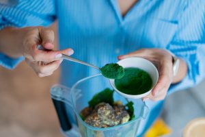
Vibrant kaleidoscope
On the other hand, ‘authentic’ could include the bright and bold. While some associate brightly coloured foods with synthetics, nature is full of vibrant colours that lend themselves to some of our favorite dishes!
Fruits, vegetables, and spices compete with ineffable vivacity for our attention: warm yellows and oranges, alarming reds, calming pinks and purples, and lots and lots of greenery. Even marine food sources like fish, mollusks and crustaceans enchant with their vivid oranges, reds, yellows, and purples.

Would you want to eat a brownish strawberry jam, or curries devoid of their bright and alluring hues? In fact, there are evolutionary reasons for our liking of vividly coloured food; as hunter gatherers, our species relied heavily on vision to detect and assess nutritionally dense food sources: golden honey, ripe fruits, and fresh game meat. It’s not surprising that we’ve transferred these preferences to prepared foods as well.
This vibrancy can easily be celebrated and recreated with a range of natural pigments including anthocyanins, carotenoids, betalains and chlorophyllins.
Dreamy pastels
A third ongoing trend in ‘authentic’ food preferences are pastel colours. It is especially noticeable in sweet categories like confectionery, dairy desserts, and pastries, and has a strong positioning among children, teens and young adults.
While pastels make some consumers think of simplicity or naturalness, pastel palettes are also reminiscent of a dreamy, imaginary world and are often associated with emotions and feelings like serenity, sweetness, and nostalgia, and lend themselves well to creative fantasy flavours.
Indulge in the whimsical dreamscape of pastel fantasy colours from Everzure® Spirulina, or colouring juices like our Vegebrite® line, over your preferred white or creamy base.

The interesting outcome is that no matter consumer preference or which food category we look at, all these colour trends can be addressed through the diverse palette of natural colours.
Contact our colour scientists to get expert guidance in choosing the best performing natural colour for your target application, and inspiration to design a consistent and appealing visual experience to delight your consumers.
Related posts
Podcast: History of Colours
Past and Present of Food ColoursYou have to know the past to understand the present Speakers: Catalina Ospina, technical marketing specialist and Katie Floyd, marketing specialist. With all of the news about food colour, we dive into the history of both

Healthy Indulgence: Colourful Goodies for Gen Alpha
The colour of healthy indulgence: BFY snacks Gen alpha ate! Figuratively and literally! Their ever-growing influence on household purchasing decisions is driving the development of adventurous sweet treats and confections. Digital experiences, visual appeal,

Podcast: Visual Flavour
Visual FlavourHow Colours Enhance Snack Experiences Speakers: Catalina Ospina, technical marketing specialist; Lora Sparks, digital marketing specialist; Scott Ondracek, senior regulatory specialist (and snack guru). In this podcast episode, we try several

Colouring Healthy Snacks
The colour of healthy indulgence: BFY snacks What is snacking for you? Is it any food that is consumed between the main meals? Or something to deter hunger + boost stamina when energy is dwindling mid-afternoon? Or maybe even a treat to relax and celebrate

Snack Trends of 2025
Colorful snacking trends to watch and enjoy Snacking is a universal habit, and yet, we all snack differently according to our demography, age, and cultural context. Terms like “empty calories” or “ultra processed foods” didn’t exist in the

Understanding ADI
Natural colours are considered food additives in the food and beverage world and are strictly regulated in terms of their identity, purity, the food categories in which they are allowed, and their usage rate. A recent example is the 2020 EFSA review of