
Take a look at Van Gogh’s Starry Night below. Observe it. Immerse yourself in it. How does it make you feel?
Post-impressionist artists, like Van Gogh, Matisse, or Gauguin used colour, not to show nature or reality as it is, but as they felt it. They strived to capture the emotional input from a scene, exploring its subjective reality. In other words, colour was employed as an emotional vessel of meaning, beyond the realistic depiction of perception. And this can be applied to more than just the world of art.
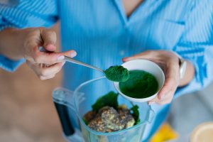
In this article we’ll explore the relationship between colours and emotions and how it plays an important role in food product design.

The connection between colours and emotions
Colours are strongly connected to emotions in ways that even pervade our language: we can feel ‘blue’ when sad, ‘green’ with envy, or ‘see red’ when mad. And similar metaphors are found in other languages: in Polish one gets ‘biała gorączka’, or ‘white fever’, when angry; in Swedish, someone is ‘svartsjuk’, or ‘black-sick’, when they are jealous, and in Spanish one turns ‘morado de la vergüenza’, or ‘purple with shame’.
Background influences on colours and emotions
But since colour psychology is a relatively new science, there is still debate about the universality of colour symbolism and whether emotions elicited by colours are ingrained in our biology, or if they are based instead on social and cultural constructs.
Examples of strong cultural biases include the use of white for mourning in parts of Asia, contrasting with the western association of black to funerals and death. And purple was used for millennia as the royal colour in Mediterranean and European cultures, while yellow was regarded as the regal colour in China, only used by emperors.
Widespread colour associations
However, there are some subjective associations that seem to be a bit more widespread – appearing in cross cultural contexts. In general, warm colours like red, orange, and yellow are correlated to high energy emotions, while cool colours, like blue, green or purple are perceived as more calm and subdued. And thus, some semi universal concepts linking colour and emotions are used in marketing, fashion and decoration, and more.

Colour and emotions in food product design
So why is this important in the context of food design? Because as colours influence moods, they also signal to action. In 90% of our buying decisions, our brains rely highly on emotions and feelings, including decisions on what to purchase and what to eat.
Colour is an important factor, not just in perceiving the flavor of a product, bur also for emotional branding – how consumers establish long term bonds with products that have a strong emotional connection with them.
Understanding moods and emotions can also help food product developers select the colour that will resonate most with their target market.
For example, in our 2023 European moods & emotions survey, we found that the colour that would maximize the association with Energizing benefit in energy drinks is vibrant orange in Italy and the UK, while a light blue shade resonates more in Germany.

Considering age and gender is also important in the design of foods and beverages. In a similar North American study, when looking at shades of blue and purple younger adults associate darker and bluer shades with a feeling of relaxation and calm, while middle aged adults associate these feelings with more purple shades.
Conclusion
If we connect back to our original example from van Gogh, let’s say you have a Starry Night buttercream cake in front of you. What part would you decide to eat? A slice of the joyous yellow moon? The azure peaceful sky? Regardless of our background, age, and gender, it’s clear that there are strong associations between the colour of our foods and beverages and what we feel when we consume them.
Interested in learning more about how the colour of our foods and beverages can impact our moods and emotions? Download our white paper below.
Related posts
Podcast: History of Colours
Past and Present of Food ColoursYou have to know the past to understand the present Speakers: Catalina Ospina, technical marketing specialist and Katie Floyd, marketing specialist. With all of the news about food colour, we dive into the history of both

Healthy Indulgence: Colourful Goodies for Gen Alpha
The colour of healthy indulgence: BFY snacks Gen alpha ate! Figuratively and literally! Their ever-growing influence on household purchasing decisions is driving the development of adventurous sweet treats and confections. Digital experiences, visual appeal,

Podcast: Visual Flavour
Visual FlavourHow Colours Enhance Snack Experiences Speakers: Catalina Ospina, technical marketing specialist; Lora Sparks, digital marketing specialist; Scott Ondracek, senior regulatory specialist (and snack guru). In this podcast episode, we try several

Colouring Healthy Snacks
The colour of healthy indulgence: BFY snacks What is snacking for you? Is it any food that is consumed between the main meals? Or something to deter hunger + boost stamina when energy is dwindling mid-afternoon? Or maybe even a treat to relax and celebrate

Snack Trends of 2025
Colorful snacking trends to watch and enjoy Snacking is a universal habit, and yet, we all snack differently according to our demography, age, and cultural context. Terms like “empty calories” or “ultra processed foods” didn’t exist in the

Understanding ADI
Natural colours are considered food additives in the food and beverage world and are strictly regulated in terms of their identity, purity, the food categories in which they are allowed, and their usage rate. A recent example is the 2020 EFSA review of