
Color matching is often necessary when customers switch natural color suppliers or move from synthetic to natural colors. In both cases, we need to match the original color as closely as possible. But how do we do this? We’ll show you using the example of replacing Red #40 in confections with natural colors.
Set a target
Color matching starts by measuring the target confection color using a laboratory instrument called a colorimeter. A colorimeter reads the transmittance or reflectance of light from a color sample and produces quantitative measurements for different aspects of the target color. These data are presented as L*a*b*
L* – represents lightness/darkness, where a value of 0 would indicate black and a value of 100 would be white
a* – represents the redness (+ value) or greenness of the sample (- value)
b* – represents the yellowness (+ value) or blueness (- value) in the sample.
Once we have the target sample measured, we record this information as our benchmark.

Use Visual Cues & Quantifiable Data
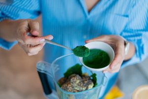
Once we have our target, benchwork can begin. First, we select a variety of natural colors at various dosage levels or create a variety of natural color blends until we have several close visual matches. We know that Red #40 is a bright red color with a hint of yellow. So, to create the blends, we use anthocyanins for the red component, and beta-carotene and turmeric for the yellow components. In order to verify which blend is actually the closest, however, we have to go back to the colorimeter to compare these samples against our benchmark.
You can see the results of the colorimeter readings below. Of the samples, the L*a*b* values for Blend #2, which contains our Amaize® Red and Emulsitech® Beta-carotene, are the closest to the corresponding values of the target sample. However, it can be confusing to look at each of these values individually. So we typically look at what is called the dE CMC value, which is essentially a sum difference between two sets of L*a* b* values. Simply put, the dE CMC tells us how different two colors appear. The lower, the value the closer the two colors are.
A dE CMC value under 3 indicates that the difference in color is so small it is difficult to detect by the human eye, so a value of 3 or under is our goal for most color matching projects. Blend #2 has the lowest dE CMC with a value of 6.11, meaning it is a good match and the closest out of the three samples to the candy colored with Red #40. But it isn’t quite right yet.


Additional Methods
You can also use an instrument called a spectrophotometer – a device used to measure the absorbance of light – to see how close you are getting to your target sample.
The results appear as a graph with a peak. The peak indicates the presence of certain colors by measuring which light wavelengths are absorbed. In the graph below, the bold red line that represents Blend #2 is closer to the peak of the Red #40 candy sample meaning that they have similar absorbance, as opposed to the purple carrot option, who’s peak is further away.

Adjust Blend Ratios & Dosage Levels
To get a closer match, we analyze the colorimeter data to decide which color components may need to be changed in order to attain a closer color match. The a* data tells us that the Red #40 sample has more red while Blend #2 has more yellow. The L* value also tells us that blend 2 is slightly lighter than the Red #40 sample.
Knowing this, we slightly decrease the amount of beta-carotene in the blend to reduce the yellow tones. And by slightly increasing our use rate, we are able to decrease the L* value to darken our color and better align with the Red #40.

Using instrumental data, visual comparisons, and a lot of experience, we can create color blends to match just about any standard!
Want to see more? Watch the video here.
Or contact us to get started on your color matching project.
Related posts
Podcast: History of Colours
Past and Present of Food ColoursYou have to know the past to understand the present Speakers: Catalina Ospina, technical marketing specialist and Katie Floyd, marketing specialist. With all of the news about food colour, we dive into the history of both

Healthy Indulgence: Colourful Goodies for Gen Alpha
The colour of healthy indulgence: BFY snacks Gen alpha ate! Figuratively and literally! Their ever-growing influence on household purchasing decisions is driving the development of adventurous sweet treats and confections. Digital experiences, visual appeal,

Colouring Healthy Snacks
The colour of healthy indulgence: BFY snacks What is snacking for you? Is it any food that is consumed between the main meals? Or something to deter hunger + boost stamina when energy is dwindling mid-afternoon? Or maybe even a treat to relax and celebrate

Snack Trends of 2025
Colorful snacking trends to watch and enjoy Snacking is a universal habit, and yet, we all snack differently according to our demography, age, and cultural context. Terms like “empty calories” or “ultra processed foods” didn’t exist in the

Understanding ADI
Natural colours are considered food additives in the food and beverage world and are strictly regulated in terms of their identity, purity, the food categories in which they are allowed, and their usage rate. A recent example is the 2020 EFSA review of
Authentic Food Colour Trends
Consumers are increasingly interested in ‘authentic’ food and beverage experiences—they want food that is as close as possible to its original ingredients or source. This can include minimally processed foods, foods that taste, smell, and look