
When analyzing the expanding market of energy drinks, enhanced waters, and sports drinks you’ll find that colour is no longer a mere indicator of flavour identity. There is a growing trend towards using colour to hint at a refreshing and invigorating experience, becoming a primary language for functional claims.
In this article you’ll see some of the predominant trends in flavour and colour use for the category and understand some practical tips to get the best technical performance from the refreshing palette of natural colours.
The colour of your fantasy
Close your eyes: you’re given a drink flavoured ‘Caribbean Breeze’. What does it taste like? Chances are it tastes like a piña colada, or perhaps an invigorating citrus-mango blend. What does it look like? Is it turquoise blue like tropical waters washing golden sands? Or is it bright yellow-orange like a warm sunset on the beach?
This is where the artistry comes in—with the increasing trend of using fantasy flavours, food and beverage colours are chosen to evoke emotions rather than simply representing the flavour used. The colour may not inform the intellect about the flavour identity but will work as an innuendo for the foreseen experience.

Conventional with a twist
Non-fantasy flavours and colours used in functional drinks are more predictable: citrus flavoured drinks that are still the default option are mostly orange or yellow. Berries and summer fruits tend to be red or pink, while orchard fruits like apple and pear drinks are often coloured light brown.
But at the same time these familiar and nostalgic flavours are increasingly mingled in novel and attractive combinations. Sometimes adjacent colours in the spectrum are selected: like in a tropical mango–passion fruit blend, but sometimes very dissimilar colours are blended, like in strawberry-kiwi mix. What would the colour of a kiwi and strawberry juice be? A very dirty brownish pink, one would think! So, again a decision has to be made on which colour to select, taking into consideration the expected sensory input, the predominant flavour and the preference of the target consumer—in the case of our strawberry-kiwi, would it be green or red?

Form follows function
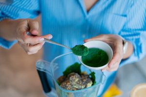
In a similar stance, in sports drinks form follows function, or in this case: colour follows function. Hydration products are often coloured blue, purple or green, because these cool colours remind us of large water bodies or the freshness of nature.
On the other hand, pre-workout beverages may want to give us the idea of energy and stamina, boosting our inner power and prepping our muscles for the best performance possible. In this case bright and bold yellow, orange, and red colours may be the best option.
Flower power
One of the fastest growing trends in new product launches is the use of botanicals like floral, herbal, and spice-based flavors in functional waters and drinks. Most of the time, these are chosen as secondary notes to more traditional fruit flavors like strawberry or lemon.
Floral flavors like lavender, violet, rose and elderflower are used because of their ties with soothing and stress reducing properties, and the palette of colours reminds us of enticing bouquets with lots of purples, pinks or peaches. “Beauty from within” drinks also leverage from botanicals and the colour range appeal their target demographics with soft, nuanced hues, that may include also greens and pastel blues.

Technically speaking
Wondering how to take advantage of the large palette of natural colours for a perfect hydration experience? Let’s review some expert tips:
Packaging
Cans and opaque packaging are often used in energy drinks and functional waters because light affects some of the botanical and nutritional ingredients used. In this case, the colours are not openly displayed but a congruency with the selected flavours or with the experience expectation is due. Light sensitive pigments, low doses and soft colours are permissible in this case, which provides a wider palette to choose from than when using transparent packaging.
However, bottles and clear packaging are still prominent in hydration beverages and other subcategories adjacent to the conventional soft drink market. Here light stability of the color chosen is a must, and shelf-life evaluations must be made to ensure colour performance.
Ingredients
Compatibility and stability of natural colours in presence of botanicals, amino acids, electrolytes and vitamins has to be assessed in a case-by-case scenario. For example: there are known interactions between natural colours and vitamin C, which enhances the stability of carotenoids but can be detrimental to anthocyanins. And the addition of botanicals like polyphenols and tannins can favor the formation of pigment complexes with completely unexpected behavior during the shelf life of the beverage. We recommend working directly with our colour experts to establish safe protocols of development to ensure the best outcome for the overall recipe.
Differentiation
Differentiation in this market is a priority: you don’t want your strawberry-watermelon drink to look exactly the same as your competitor’s red generic drink! Fortunately, anthocyanin sources allow for both subtle or dramatic variation in both hue and intensity, be it for passionate reds or delicate pinks.

Interested in working on a functional or enhanced beverage project? Contact us to turn your thirst-quenching product into a colorful escapade. Or request a sample here.
Related posts
Podcast: History of Colours
Past and Present of Food ColoursYou have to know the past to understand the present Speakers: Catalina Ospina, technical marketing specialist and Katie Floyd, marketing specialist. With all of the news about food colour, we dive into the history of both

Healthy Indulgence: Colourful Goodies for Gen Alpha
The colour of healthy indulgence: BFY snacks Gen alpha ate! Figuratively and literally! Their ever-growing influence on household purchasing decisions is driving the development of adventurous sweet treats and confections. Digital experiences, visual appeal,

Podcast: Visual Flavour
Visual FlavourHow Colours Enhance Snack Experiences Speakers: Catalina Ospina, technical marketing specialist; Lora Sparks, digital marketing specialist; Scott Ondracek, senior regulatory specialist (and snack guru). In this podcast episode, we try several

Colouring Healthy Snacks
The colour of healthy indulgence: BFY snacks What is snacking for you? Is it any food that is consumed between the main meals? Or something to deter hunger + boost stamina when energy is dwindling mid-afternoon? Or maybe even a treat to relax and celebrate

Snack Trends of 2025
Colorful snacking trends to watch and enjoy Snacking is a universal habit, and yet, we all snack differently according to our demography, age, and cultural context. Terms like “empty calories” or “ultra processed foods” didn’t exist in the

Understanding ADI
Natural colours are considered food additives in the food and beverage world and are strictly regulated in terms of their identity, purity, the food categories in which they are allowed, and their usage rate. A recent example is the 2020 EFSA review of