Of course you can replace synthetic colors! There are natural color options that work for just about every color in just about any application.
However, each natural color has its own distinct properties, so you may not be able to get the exact shade, vibrancy, or stability as you can with a synthetic color. That’s why we often call them ‘natural alternatives’ rather than replacements. Below are some considerations you should take into account if you are interested in switching:
How to do it
1) Determine your objectives
When switching to natural colors, the main objective is usually to create a simple label product for consumers. By replacing synthetic colors with natural alternatives, you can already check that off your list.
Secondary objectives are generally cost or hue driven.
Cost
We’ll be honest – natural colors are more expensive than synthetic colors. But there are many economical natural colors available. If you need low-cost natural color, you may have to compromise on the hue of your product.
Annatto, for example, is a widely used, economical yellow to orange color and can be used to replace Yellow #5 (Tartrazine) at low dosages or Yellow #6 (Sunset Yellow) at higher dosages in many applications. However, it is not always the best match for either synthetic color. Turmeric and Safflower are generally better matches to Yellow #5 while Paprika is a great alternative to Yellow #6, but the cost for these colors can be higher. Blends can get you even closer to synthetic shades but require development time and expertise.
Hue
Alternatively, if your main goal is to match the color and you have some flexibility around cost, you can generally get a very close match because it opens the door to more color options and custom blends. We use a colorimeter, a device that measures color, to determine which natural color or blend give the closest visual match to synthetics in your formulation.
Can you tell which of these panned candies uses natural colors and which uses synthetic? Hover over each image to find out.
Yellow #5
Turmeric
2) Dosage rates
Dosage rates for natural colors are usually much higher than synthetic colors. Typical use rates for natural colors are between 0.1% and 1.0%, depending on the color strength, your formulation, and your target color.
If your product has specific requirements in terms of water content, like white chocolate or compound coating, you’ll need to take that into account when choosing the color intensity and format (liquid or powder) of your natural color. Don’t worry! There are options to suit just about any need.
3) Packaging
You may also have to make decisions on your natural color based on your packaging. Turmeric can be a great alternative to Yellow #5 (Tartrazine), for example. But unlike its synthetic counterpart, it fades when exposed to light.
If your packaging is transparent or has a window and changing it to accommodate the color isn’t an option, beta-carotene is a better choice. While the color is not as close of a match as turmeric, it will stand up much better to light.
4) Manage expectations
While there are many natural color options out there to replace synthetics, an exact color match, usage level, or cost might not be possible with your application. ‘Fluorescent’ or ‘neon’ qualities often associated with synthetic colors are the most difficult to achieve. Knowing your development priorities and what areas you are willing to compromise on, will make for a smooth switch.
An experienced color company should be able to work with you to choose the best natural color to replace synthetic colors for your application. Often, a blend of natural colors is the best solution to balance match, stability, and cost. And the premium price that a clean label product commands easily offsets the cost incurred from switching.
Ready to get started? Contact us for a color consult!
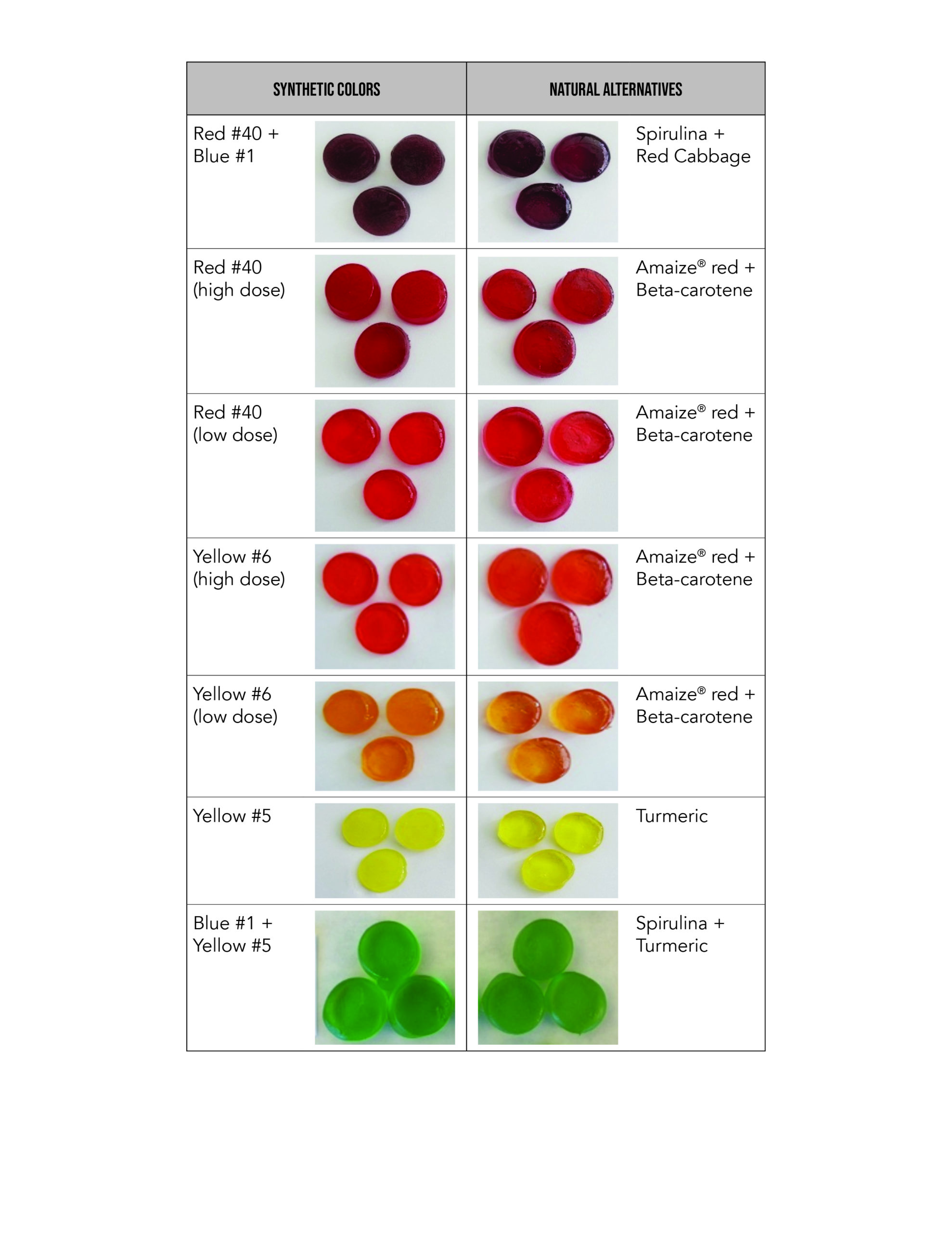
Check out the chart below to see how we matched some common synthetic colors in confections:


